Sunday 30 January 2011

Fabric testing

I had no idea what some of my fabrics were made from so I decided to use the burn test to help me identity if the swatches were cotton, wool, silk or polyester.

Cotton smells like burning paper and its ashes are soft, fine and turned to dust. The cotton ignites when as the flame draws nearer.

Wool or silk smells like burning hair or feathers. Silk doesn’t burn as easily as wool.
Wool turns black and brittle and can crush between your fingers after being on fire.

Polyester or synthetic fabric smells like chemicals and it turns into hard black lumps. It also curls away from itself and melts.  


At the start I thought the yellow polyester corduroy was cotton but I noticed it burnt with a plastic edge.
I thought the velvet wool cord was polyester but discovered it burnt with a burning hair smell and its ashes were black, hard and crumbly, not a plastic ‘blob’.
Originally I thought the red cotton cord was polyester but it smelt like paper, its ashes were soft and it didn’t create a plastic edge.

Fabric swatches

As a side project at Chelsea, I’m collecting enough fabrics to make swatch book. I have hoarded a whole range of fabrics from school, college, charity shops, friends and family over the past few years that I have well over 150 different types of fabric.
This is great, but it’s created a challenge for me to name and describe all of them. This is an ongoing project for when I get some more.

Saturday 29 January 2011

Recyling in embroidey

To continue my research into creative I found a really helpful book in the library. Creative recycling in embroidery by Val Holmes. Val Homes is a successful textile designer as well as teacher an author from France. This book focuses on recycling and reusing waste. Recycling is so popular at the moment and its great to find new way to incorporate it into textiles. The book goes through way you can recycling, giving ideas on different techniques. It goes through how to reuse fibre, fabric, paper, plastic, wood, metal and packaging waste.
I really recommend this book for anyone interested in recycling because its just so inspiring.


Theory. Starting my research and essay

I want to use this opportunity to research into Creative embroidery. Embroidery is a skill I like to practise a lot and I enjoy developing my range of stitches and techniques. It’s pretty and traditional, but I want to look at how modern designers use it in a new light. This will allow me to cover a vast range of subjects and to research into many techniques, to then hopefully pinpoint on area that really sparks my enthusiasm. I’m interested in both machine and hand embroidery, although it’s the hand skills that I can really relate to. I’m also interested in how fashion designers use embroidery on garments, stitching on top of print and other experimental styles.
Allessandra Facchinetti for Valentino, fall 2008, created a outstanding collection demonstrating just how creative embroidery has become. The collection is very experimental for Valentino and if anything a little too heavy. But saying this she carried it off beautifully and the embellished dresses and coats are easily wearable.
In an interview Facchinetti tell us her inspiration:
 “I researched embroidery, looked at Van Dyck and contemporary paper sculpture. I was looking for a strong way to interpret romance, but without the usual sweetness”.


An alternative textile designer is Waltraud Janzen. He creates pieces for art purposes, completely using appliqué and machine embroidery. He likes to work with silk to give his pieces a feminine touch.
My favourite piece of his work is the crazy ‘capriccio’ 1990. He’s layered so many threads onto silk that it turns into a colourful mess!


'Bowl' 1990. pieces of silk hand sewn to form a patchwork bowl


'Capirccio' 1990. Hand and machine stitch onto a silk canvas


'secret message' 1989. freehand machine embroidery onto silk.


Friday 28 January 2011

Consumption lecture

Following up last weeks lecture, this time we looked at how consumerism affects us and the different types of shopper we can be. We talked about the various ways we choose goods and how we can categorise ourselves into the way we make a purchase. These groups are as follows:

· The rational consumer
A free thinking individual who seeks the maximum satisfaction.
· The victim consumer
Getting sucked into the concept that this product will improve your life.
· The rebel consumer
Rejecting the mainstream
· The communicator/ identity seeker consumer
People who want to form an identity and use the goods we buy to express ourselves.
· The social status consumer
Trying to tell everyone how upper class we are
· The explorer consumer
Seeking new pleasure and adventure

I am absolutely the ‘Identity’ consumer. I really do think about what clothes I buy and how this communicates my desired personality.

Digital print.

Using Photoshop is a skill I really enjoy. Although it’s not working with your hands so much in a creative way, I still find it an extremely creative process. I’ve been manipulating images for a few years now, more so with photography, so I have a good understanding of how Photoshop works.
For this block we were asked to complete two digital scarf designs using our drawings. This is great to actually have an item printed and go through the whole design and print process using our own ideas.
I was especially excited by Damien Hirst’s butterfly kaleidoscope designs. They’re so colourful and complex and designed using Photoshop. I choose to use this style but I needed to make sure they were a true representation of my own work, not just a copy. I did this by cutting scanning in my butterfly’s which I cut out of magazines. Then arranging them in a circular pattern I could create my own kaleidoscope motif.


Tuesday 25 January 2011

The Comfort of Things

The ‘comfort of things’ by Daniel Miller is a book written about a social experiment. Daniel Miller listen and learns from a completely normal street to see what really matters to people and how they live their lives.
It reveals their worries, troubles and stories of the people behind the doors.

We were given a task to read a certain chapter from this book, mine was Portrait 1 Empty. This told the tale of a seventy-five year old man who’s life has never began. I found this text depressing and very uneasy to read.

Here are a few sentences from the text:
“During our time in the street we heard and encountered many tragedies, people who faced all manners of diseases and degradations, who nearly died, who actually dies, whose children had been killed. There is no escaping the horror and tragedy in the interior of peoples lives. But it was particularly after meeting George that we found ourselves in tears after leaving his flat. Because in every other instance there was a sense that, at least, that person had once lived. With George, by contrast, one simply couldn’t escape the conclusion that this was a man, more or less waiting for him time on earth to be over, but who at the age of seventy-six had never yet seen his life actually begin. And, worse still, he knew it.”

George's flat was described as being empty from personal touches.

Stitch samples!

I’m so pleased with my final samples. I tried and tested small techniques and design samples to find the right combination and style. I bought some PVC from the A1 fabric shop in Shepherd’s Bush Market. I haven’t really experimented with PVC before and it was great to work with. I like the hardness of the material which makes it a perfect base as well as a good fabric to cut into as it doesn’t fray. This made it the ideal material to cut into.
However the white PVC background did often look dull and boring and didn’t feel like my own work. Therefore I customised it by using bond-web. I stuck threads and fabrics to the PVC and worked on top of this base.


Monday 24 January 2011

Project influences

My drawings are about shapes, patterns and using the positive and negative spaces of an image. I’ve also been cutting into paper and over lapping it. This really reminds me of using the laser cutter. Here are few designers who have used the laser cutter into fabric with amazing results.


All three above John Paul Galtier fall 2009 using a laser cutter into leather.

I focused on the butterfly motifs in my drawings, with them a slightly illustrative look. The butterfly image is sp pretty and it gives me a whole range of colours and patterns to work with. I absolutely love the work of Damien Hirst who uses photos to arrange a butterfly pattern using a kaleidoscope. The colours are exquisite, with a beautiful abstract pattern. This would be a really useful and lovely technique to try when considering my digital print design work.


                                               Damien Hirst's brightly coloured butterful prints.

The start of my Stitch and Print testers

Stitch is definitely a pathway I will consider. All of my work is massively influenced by stitch and I enjoy it very much. I use a lot of traditional techniques like hand stitching but I also like to mix it up with my own style, which I’ve always regarded as being modern.

My recent project for stitch and print was looking at moulds. Not fungus mould but ice-cube, jelly and cookie cutter moulds. This concentrates on positive and negative space, patterns and imprints.
I focused on drawing a fish shaped ice-cube mould, butterfly, dragonfly and bumblebee ice-cubes and cookie cutters.


Sunday 23 January 2011

Fashion Identity exhibition

The exhibition brings together a group of contemporary artists and innovative fashion designers to examine four themes.
It begins with story telling, recognising clothing in history and culture. Then building, using clothing as protection, next belonging and confronting and finally performance.

The first thing you see is a bizarre dress suspended in a bowl of water. This is from Helen Storey’s ‘Say Goodbye’ 2010 collection.
It’s made from clear PVC and experiments with dissolving and in fact the dress stops at the tip of the water. It’s made from a biodegradable material with enzymes dissolving the surface when in contact with water.
I love the way this is displayed. It’s so dramatic in a huge bowl of water that it immediately draws you in.


In the first room there’s a strange video of one of those toy paper dolly’s where you can clip on the paper clothes. The dolly is a real person rather than a cartoon and comes to life to try on the clothes. She’s then snatched away by a human hand. It’s a confusing video made in 1975 by Cindy Shereman demonstrating the diminishing of women’s opportunities and self transformation.


In the building hall there is a dress that caught my eye by Yahu yamomoto’s from his ‘Feme’ collection in the autumn/winter of 1991/92. It’s so constructive and illustrates protection perfectly. Being completely architectural its wooden demonstrating Yahu’s want for regaining respect for clothing and women’s independence. The brackets make the wood curve insulating the curves of fabric. 

My absolute favourite piece in the exhibition is a collection of beautiful children’s dresses. They use an African technique, batik with bright colours and patterns. It was actually produced in Holland but found no market in Europe. This suggests how the market consumes and African dresses aren’t appropriate here.

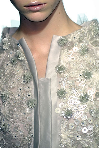
I did enjoy the exhibition, it had a lot of beautiful pieces as well as cleaver thought out designs but it didn’t excite me as much as other exhibitions before. I loved the witty designs of Meschac Gaba’s Wigs Architecture and the delicate lace from Alexander McQueens Red lace dress. But I just think the collection had more to offer.

The website for the exhibition is really good; it has so much information about individual pieces and their artists.
http://www.royalacademy.org.uk/exhibitions/gsk-contemporary-season-2010/exhibition/

Consumption

Our lecture this Friday both confused me and intrigued me. Consumption is a growing phenomenon and links us to people across the world.
It’s hard for me to get my head around consumption but to put it into context, consumption is in the hands of the investor and we need it to help our economy grow. In the recession our banks went bust which lost the faith of the consumer, therefore we weren’t buying, shopping and ultimately investing in the economy. 
Fashion and textiles consumption is decided by growing trends and reports to a global audience.

We were each given a card with a sentence describing an event in the history of consumerism.

‘Increasing power of multinational companies’.

So many things have influenced consumption. To name a few, the Italian Renaissnce 1300-1600, the slave trade, 1619-1680, the Art’s and crafts movement, 1800, the Great Depression, 1930 and Thatcherism, 1980.
Nowadays consumption is turning post materialism. Consumers are rebelling against poor working conditions, especially in clothing and non environmental products.

Monday 17 January 2011

Knit Samples

Over the two weeks I tried and tested knit and found it, annoying, painful, maddening but in the end rewarding. I got in a lot of mess, muddling threads and getting my samples in a knot. I did alright, but it is not the specialism for me. As usual I couldn’t resist stitching a few letters and patterns here and there.


Two knit samples sewn together using an elongated stitch

I spent ages rubbing this sample to turn it into felt.
When this didn't work I put it in the washing machine and felted perfectly

 
Chain stitch on top of knit
 
My most fustrating knit but I'm so glad I stuck it out to the end!


Tutu’s and Point Shoes

Following the major ballet exhibition, the Ballet Russes and the release of the film ‘Black Swan’ starring Natalie Portman, a wave of ballet inspired fashion has hit the shops!


Darcy Bussel in the Royal Ballet's production of 'Sylvia
at the Royal Oper House
Natalie Portman in the 'Black Swan'
 The dark ballet film has influenced designers such as Sarah Burton for Alexander McQueen, Giles, Karl Lagerfeld for Chanel and Stella McCartney with tutu shapes in netting, lace and chiffon.

Giles, Spring/Summer 2011


Sarah Burton for Alexander McQueen
Spring/Summer 2011


Feminine styles influence my own work as well, especially gorgeous draping and pleated chiffon.
It would be an understatement to say the Ballet Russes exhibition is big. It is so huge it fills up three large halls. Although this is amazing and very impressive, it’s a lot to a take in, in one go.
The collection was so varied, telling many stories. I didn’t know much about the Ballet Russes or Diaghilev so it was interesting to realise how much he revolutionised ballet and costume design.
    I enjoyed seeing the costumes and their intricate design details. My favourite garment was actually worn by a young boy, which I was surprised to find out because it was a very beautiful dress.  

The video clips of the dancers were brilliant. It bought the costumes to life, seeing all the components, stage, movements and music in place.

A dancer modeling a costume in front of the frontcloth for ‘Le Train Bleu’ at Sotheby’s auction house.
Photograph by Nesta MacDonald, 1968. V&A Theatre & Performance Collections


A great deal of work was put into this exhibition. Added extras, such as video clips of the dance choreography with explanations from professionals, helped me understand the technical expressions of the dance.

My absolute highlight was walking round the corner and being stunned by the Stage Backcloth for the Wedding scene in ‘The Firebird’ by Natalia Goncharova. What impressed me was the way it was displayed. There were dancer’s silhouettes playing on the wall, lit  with bright red and loud music playing from the ‘Firebird’.
The 1926 Backcloth for 'The Firebird' Ballet by Natalia Goncharova

http://www.vam.ac.uk/collections/theatre_performance/diaghilev-ballet-russes/exhibition/index.html